

The project
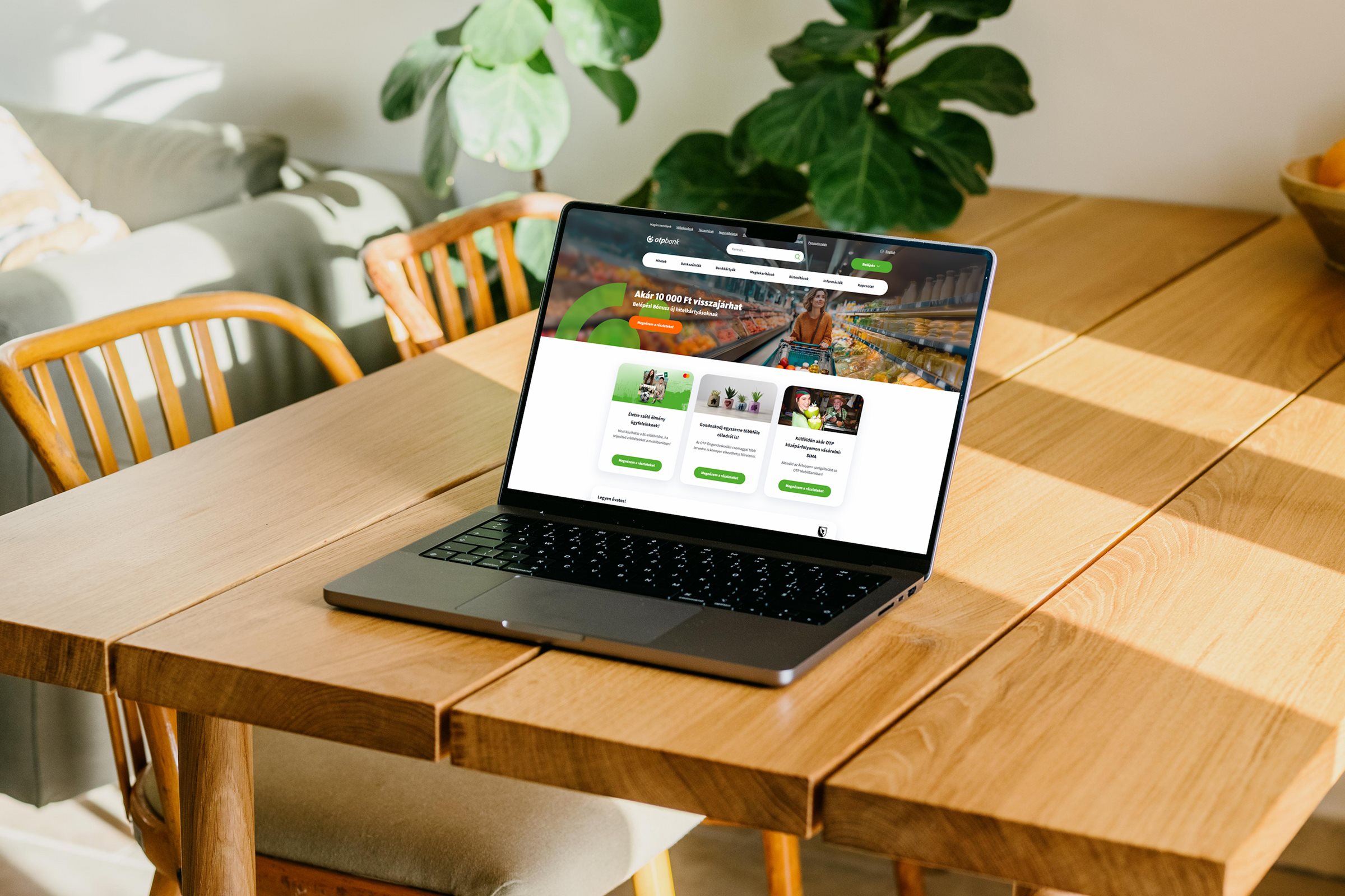
The OTP Bank digital overhaul covered the web presence of Hungary's largest bank — from content structure to brand identity. I led the design team and owned the client relationship.
The challenge
The bank's digital surfaces were product-focused — they offered loans, account packages, investment options. Research showed that customers thought in terms of life situations: buying a home, expecting a child, starting a business. There was a gap between what was offered and how customers actually thought.
That had to change.
Process
Content and structure · 2016–2018
We looked at which pages got the most traffic and compared that against business priorities. This revealed that visitor interest and business goals often pointed in different directions — a tension we had to resolve. Based on the data, we defined the main user types, broke down the site's content, and designed complete customer journeys. We restructured page content and copy to avoid jargon and get the important information across quickly and clearly. Every page was designed as part of the full customer journey — we looked at where the visitor came from and which touchpoints of the bank they'd cross: branch, call center, web.
Brand and design system · 2018–2020
Brand designers developed the new visual identity, and we built the design system on top of it, keeping both consistency and development efficiency in focus.
Research methods
Decisions
Structure first, brand later
A deliberate choice: for the first two and a half years we focused exclusively on content and page structure. Without a stable architecture, a visual refresh only produces surface-level change.
Life-situation structure instead of a product list
The bank thought in products, customers thought in life situations. The new structure started from the customer's question — buying a home, starting a business, saving money — instead of the product catalog.
Partnership
We treated OTP's internal team as active participants in the process. The trust we built with bank colleagues let us spread a design mindset effectively — shared decision-making led to faster buy-in and more effective collaboration.
Outcome
Four years of work produced measurable, concrete results. The digital overhaul also reduced load on physical channels. Designing around the customer journey paid off.
Takeaway
When the plan is right, building the interface is the easy part. The hardest work is understanding the ecosystem, building the research plan, and mapping the business needs.