The project
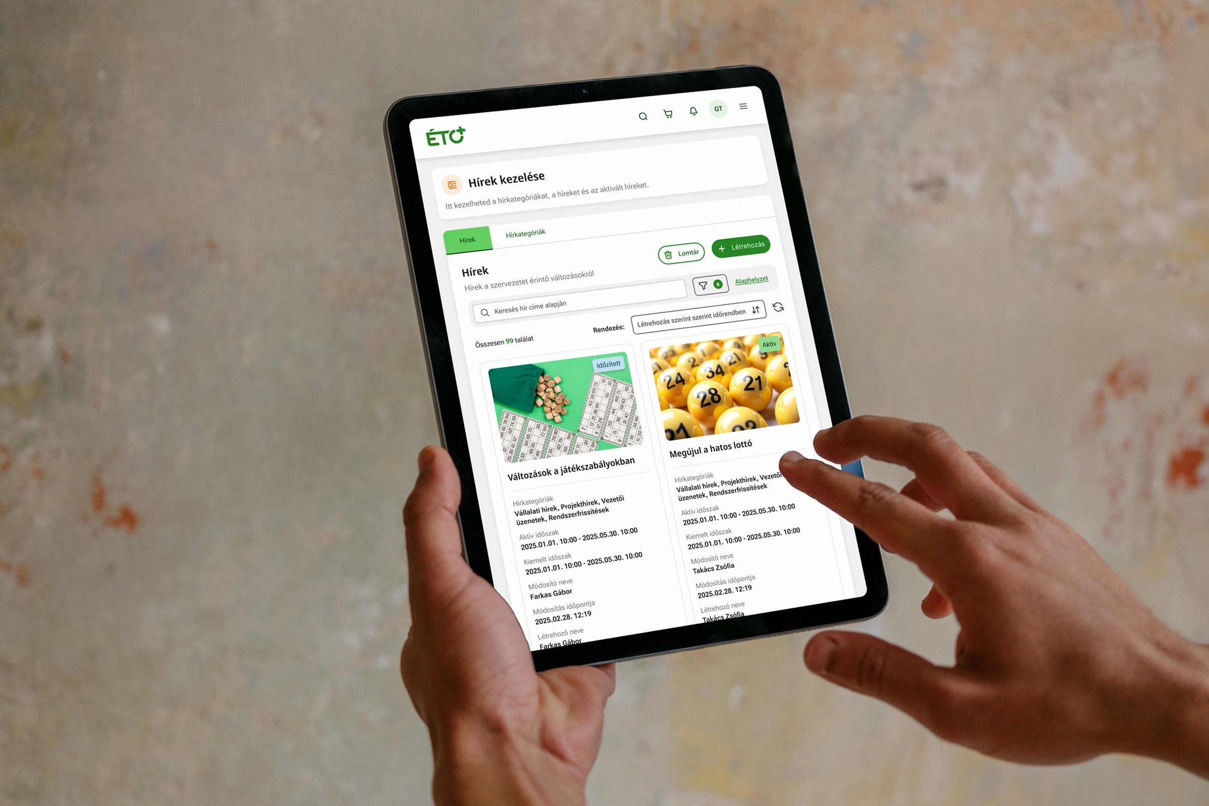
ÉTO+ is the internal management system for the retail network of Szerencsejáték Zrt., Hungary's national lottery and gambling operator — a single platform used by both head-office and retail staff. Inventory tracking, store planning, document and CMS management, incident reporting — these are just a few of its areas. We built the interface and the system together with designers and business analysts, for desktop, tablet and mobile alike.
The challenge
The existing system had accumulated over years. Features were built ad hoc, with no overarching plan — the result was a disjointed interface where daily work drained more energy than it gave back.
This wasn't a simple visual refresh. We had to restructure the entire content of a large, complex system: dozens of workflows, distinct user roles, and vast amounts of data, all organized so everyone could find what they needed.
Process
Research started from two directions at once: the users and the system.
User interviews mapped out who does what in the system, what tasks they perform daily, and where they get stuck. Heuristic evaluation showed where basic usability principles were being violated. Tree testing played a key role in shaping the information architecture — it shows whether users can actually find the content they're looking for.
The research revealed that different user groups worked in substantially different ways — different modules, different order, different frequency. This defined the logic of the architecture: entry points organized by user role, not a main menu organized by module.
We built prototypes and tested them with each user group, refining the structure and navigation based on the iterations.
Repetitive work accelerated with AI agents
Once the UI library was ready, I had AI agents generate interface variants from the text specifications provided by business analysts: the agents turned those specifications into UI-description files compatible with a custom-built Figma plugin, and importing them produced the finished screens automatically. This freed up time for higher-value design work — handling edge cases and quality assurance.
Decisions
Content first, interface second
The system's biggest problem wasn't visual — it was structural. The sheer number and complexity of workflows was itself a major organizational challenge; without untangling it, no interface could keep the user oriented. Visual design could only sit on top of a stable architecture.
Role-based navigation
Head-office and retail staff do different work. Instead of everyone seeing the same main menu, the entry point adapts to the role — everyone sees what's relevant to their job first.
Desktop, tablet, and mobile at once
Retail staff sit in front of a tablet or a phone, not a desktop computer. We designed the system for all three screen types from the start — tablet and mobile weren't an afterthought, they were a design requirement.
Outcome
ÉTO+ is still in development — the UI designs, refined with feedback from user testing, are complete. Research and tree testing confirmed that the role-based structure reduces navigation errors and search time.
Takeaway
In designing a complex system, the biggest work lies in the architecture — the sequence of decisions that determines how content is organized. Get the structure right, and the interface becomes self-explanatory to users. Repetitive tasks can be automated with AI agents, freeing up more resources for structure and edge-case handling.